Why Crypto IV Spikes Before Expiry: The Bow Shock
Why does crypto implied volatility spike before expiry? An IV Footprint heatmap shows a bow-shaped front flaring at the wings before each Deribit settlement.
This is an observation note from Cayo Lab, not a tutorial. It assumes the volatility smile, Black-Scholes vega, and the idea that options are priced off implied rather than realized volatility. The pattern it describes is known to options desks. What is uncommon is seeing it, as a repeating structure, in volume-filtered traded volatility on crypto's daily expiry schedule.
The Pattern, and the Claim
Bitcoin throws a volatility shock wave ahead of every expiry. It is hard to see on the tools most people use, and obvious on one most people do not build.
Take every option that actually traded, keep only the strikes and timestamps where real volume changed hands, and color each cell by its implied volatility. Strike climbs the page, calendar time runs across it. The result is an IV Footprint, the volatility the market paid rather than a smoothed surface a model quotes. Do this for BTC on Deribit and a structure repeats once a day. Hours before each 08:00 UTC settlement, implied vol flares at the wings and arcs inward toward the money, a bright front that leads the expiry line and curves onto it like the bow wave ahead of a hull. Five daily expiries in the window, five of these fronts.
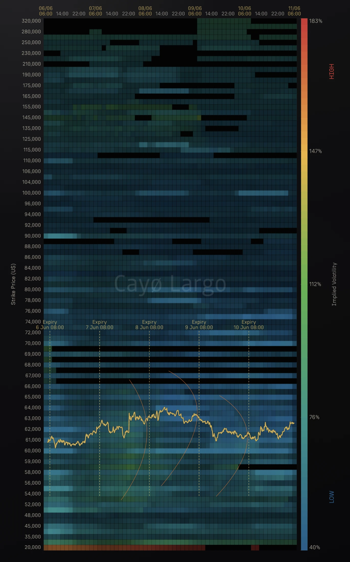
Figure 1: BTC IV Footprint. Traded implied volatility, only where volume changed hands, strike up the page and time across it. Ahead of each dashed expiry line the wings run hot while the at-the-money band stays cool, a bright front that leads each 08:00 settlement and curves onto it. The yellow track is spot. Read it as a field, not a forecast.
The claim is narrow and worth stating plainly. The mechanism behind this is not new, and the article will say so twice. The observation is that a known piece of options theory, the way short-dated volatility behaves at the wings, leaves a clean periodic signature once you stop smoothing the surface and start plotting only what traded. Everything below drives a live tool, our IV Footprint thermography panel, and the figures are screenshots of it.
What the Footprint Measures
Most volatility tools show one of two things. A single-expiry smile, implied vol against strike for one maturity at one instant, or a fitted surface, a smooth sheet interpolated across strike and tenor and then quoted as a mid. Both are useful and both hide the thing in Figure 1. The smile shows one slice in time. The fitted surface averages the traded prints into a continuous function, and the averaging is exactly what erases the pre-expiry front.
The Footprint does neither. It keeps the raw, volume-filtered prints. A cell is dark unless options at that strike and time actually traded, and where they did, the color is the average implied vol of those trades. No fitting, no interpolation, no fill. That choice matters because the pre-expiry flare lives in the wings, where prints are sparse and small, the first place a smoothing step throws information away. By refusing to smooth, the panel lets a thin band of small wing trades speak, and that band is where the bow comes from.
Why the Wings Flare
The cause is mechanical. As an option runs into expiry its vega, the sensitivity of its price to volatility, thins toward zero. Vega is
and the pulls it to zero as remaining life shrinks. Away from the money the standard-normal density is small as well, so the wings start thin and collapse first. Yet a contract that is nearly dead still trades for a few dollars, a minimum tick of cheap convexity, a lottery ticket into the settlement.
Now invert the pricing. The implied volatility is the number that reprices a traded premium through Black-Scholes, and its sensitivity to that premium is the reciprocal of vega,
As vega collapses, that reciprocal blows up. A small, floored premium on a low-vega wing option can only be expressed as a large implied volatility, because there is no other way for the model to carry the price. The thinner the vega, the larger the number the solver returns for the same handful of dollars. That is the entire engine of the flare. The formal backing is the small-maturity smile literature and Lee's moment formula, which bound how steeply the wings rise with log-moneyness as maturity shrinks. The Footprint just lets you watch it happen.
Why It Bows
A wall would be a vertical band of hot color sitting on the expiry line. What Figure 1 shows is a bow, a front that arcs ahead of the line and closes onto it. The curve comes from three facts working together.
| • | Far strikes enter the regime first. A strike deep in the wings has tiny time value many hours before expiry, so its vega is already thin and its implied vol already lifting. The flare appears earlier in time the further you sit from spot, which tilts the front forward of the line. |
| • | Near strikes hold out. At-the-money options keep meaningful time value until the last hours, so their implied vol stays anchored while the wings are already hot. The front reaches the line latest at the center. |
| • | The center is pinned. Dealer hedging concentrates into the daily fix and tends to pull spot toward the heaviest strikes, a pinning effect we trace through a BTC expiry elsewhere, which compresses realized volatility at the money. Cool pinned center, hot bowed wings, and the contrast is the shock. |
Stack those and the iso-volatility contour is no longer vertical. It leads with the wings, lags at the center, and curves between them. That is the bow, and it is the same shape every day because the same clock drives it.
The Vega View, and Why It Does Not Settle It
The obvious next move is to plot vega and check. The panel that comes closest is Vega-Weighted Volume, the traded volume times average vega in each cell, and it pays to be careful about what it can and cannot say.
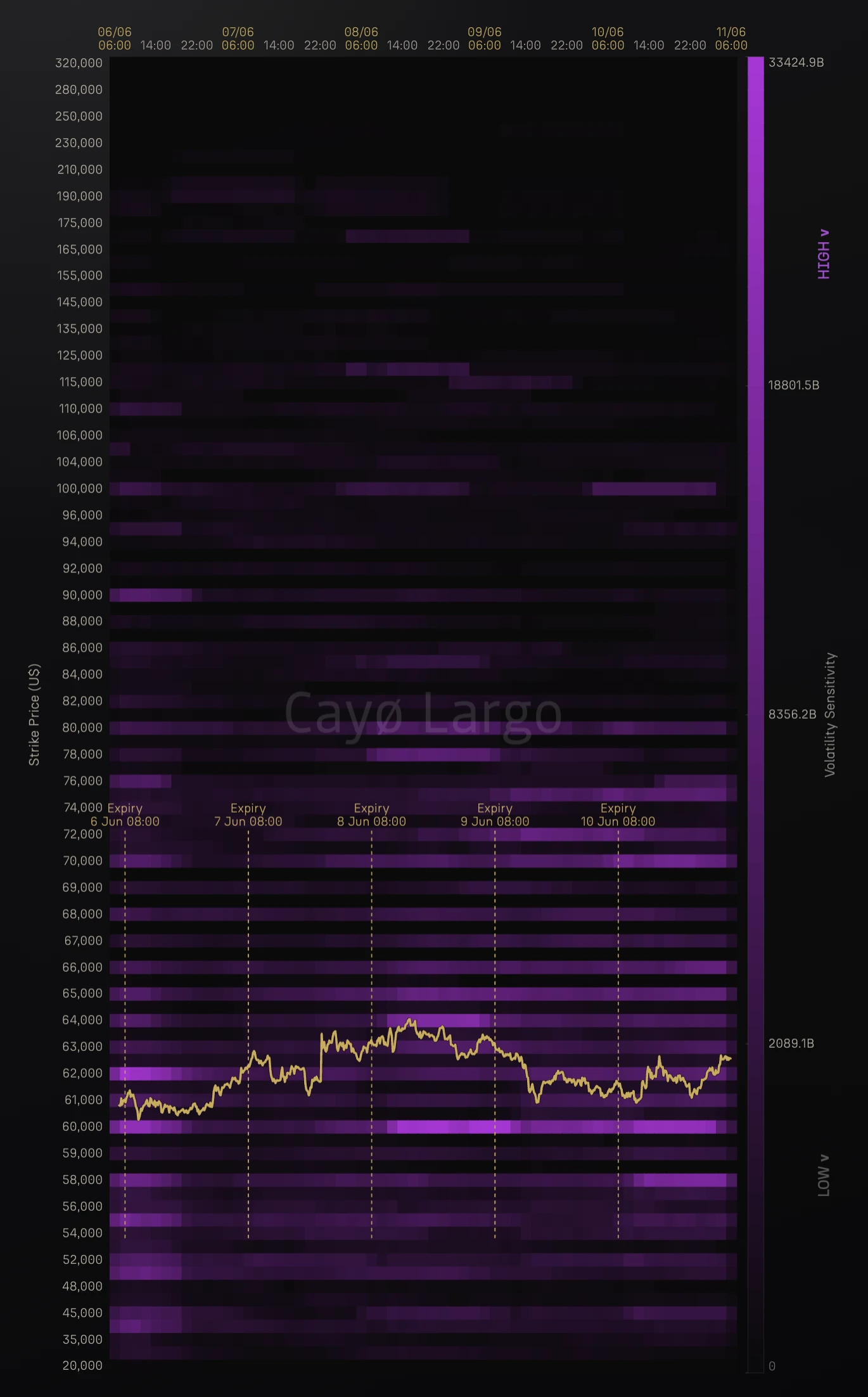
Figure 2: BTC Vega-Weighted Volume, the same coin and window. Note what it is, volume times vega, not vega. The bright cells are heavily traded round-number strikes spread across moneyness, not a clean at-the-money band, which is why this panel cannot confirm the wing claim on its own. The far wings going dark is consistent with thin wing vega, but it is confounded with thin wing volume.
The honest reading is that this map does not confirm the claim, because it is not a map of vega. It is a map of volume times vega, and volume dominates it. The bright cells are not a band around the money. They are horizontal stripes at the heavily traded round-number strikes, 60,000, 80,000, 90,000, 100,000, spread across a wide range of moneyness, wherever capital chose to sit. The 60,000 strike runs as bright as anything on the chart while sitting below spot, and 90,000 and 100,000 light up well above it. Read this panel and you learn where vega-bearing volume traded, not how vega is shaped across strikes.
What it does show, weakly, is that the far wings go dark. The extreme out-of-the-money strikes, the ones screaming in the Footprint, carry little here. That is consistent with thin wing vega, but it is confounded with thin wing volume, so it is suggestive and not proof. To actually see the vega profile you would strip the volume out and plot the bare Greek across the grid, which is a different panel.
So the confirmation does not come from this picture. It comes from the maths. Vega is , the density is small in the wings, and the inversion does the rest, whatever volume happened to print. The vega panel is a useful read on where activity sat, not the proof of the flare, and it would have been too neat to claim otherwise.
Crypto Adaptations
The physics is general. Crypto sharpens every part of it. Deribit settles daily at 08:00 UTC, so the front is not a monthly event you wait for but a daily train you see five of in a working week. The market never closes, so there is no overnight gap to break the structure into disconnected sessions, the bow runs in continuous time. And demand for tail protection in a market that can gap at any hour keeps the deep wings bid around the clock, which holds the wing premia, and therefore the wing implied vols, elevated rather than letting them decay to nothing between events. The same effect equities reveal once a month, on a chart with overnight gaps, crypto reveals every day and unbroken.
Known Mechanism, Rare View
None of this is news to an options desk. Short-dated smiles blow up at the wings, the term structure of skew steepens into expiry, and the asymptotics were written down years ago. The honest framing is that the mechanism is expected and the view is rare, and two things should travel with the picture so it is not oversold, i.e.:
| • | Traded, not quoted. The Footprint colors cells by the implied vol of trades that printed. A thin wing band is driven by a few small premia, so it carries the conviction of small size, not deep liquidity. |
| • | Demand and measurement, both present. Part of the flare is real money paying up for tails. Part is the repricing artifact, a small premium expressed as a large vol once vega thins. The first marks where hedgers are paying up. The second marks where the quoted number quietly stops meaning what you assume it means. |
A fitted mid surface would show a milder version of the same front, which is the point. The contribution here is the lens, not a new physical effect. Plotting volume-filtered traded implied volatility across strike and calendar time turns a textbook asymptotic into a picture you can point at, a periodic bow shock before every settlement.
What This View Adds
Most volatility tools optimize for a clean surface, and a clean surface is precisely what hides this. The Footprint optimizes for the opposite. It keeps the raw traded prints, refuses to fill the gaps, and lays time horizontally so a once-per-day structure becomes a repeating pattern instead of a single smeared snapshot. Read that way, the chart does three things a fitted surface cannot. It shows the wings honestly, where the pre-expiry action lives and where smoothing does the most damage. It dates the structure, tying each front to its 08:00 settlement so the cadence is legible. And it keeps the measurement visible, so a reader can separate the demand from the artifact rather than trusting a single interpolated number.
The bow was always in the data. The work was refusing to average it away, and being honest about which half of it is real. That is what this note set out to show, and what the live IV Footprint panel keeps showing, one expiry at a time.
Frequently Asked Questions
Why does implied volatility spike before options expiry?
Because an option's vega, its price sensitivity to volatility, falls toward zero as expiry approaches, and fastest at strikes far from spot. The contract still trades for a small non-zero premium, a minimum tick of cheap convexity. The only implied volatility that reprices that floored premium on a nearly dead option is a large one. The implied vol the solver returns moves inversely with vega, so as vega collapses the number climbs. The effect is strongest in the wings, which is why away-from-money strikes light up before each settlement.
What is an IV footprint heatmap?
It is a heatmap of traded implied volatility. Strike runs up the page and calendar time runs across it, and each cell is colored by the average implied vol of options that actually changed hands there, filtered to cells with real volume. It is not a fitted or smoothed mid surface. It shows the volatility the market paid, only where capital moved, which is what makes the pre-expiry structure visible rather than averaged away.
Why is implied volatility higher for out-of-the-money options near expiry?
Two forces stack. Out-of-the-money options have low vega at any time, and vega shrinks further into expiry, so a small traded premium can only be expressed as a high implied vol. On top of that, persistent demand for cheap tail protection keeps the deep wings bid. The result is a volatility smile that steepens sharply as expiry approaches, with the wings climbing well above the at-the-money level.
Does Bitcoin implied volatility behave differently from equities near expiry?
The mechanism is the same, but crypto sharpens it. Deribit settles daily at 08:00 UTC, so the pre-expiry structure repeats as a daily train rather than a monthly one. The market trades 24/7, so there is no overnight gap to smear the pattern. And round-the-clock demand for tail hedges keeps the deep wings bid at all hours. The same physics that equities show monthly, crypto shows every day and in continuous time.
What causes the volatility smile to steepen as expiry approaches?
Small-maturity asymptotics. As time to expiry goes to zero the implied volatility smile steepens and the term structure of skew steepens with it, a result formalized by the small-time smile literature and by Lee's moment formula for the wings. In practical terms, the premium floor and the vega collapse mean far strikes reprice to ever-larger implied vols faster than near strikes, so the smile gets wider and sharper the closer the clock runs to settlement.
Is the pre-expiry IV spike a known effect or a data artifact?
Both, and it is worth separating them. The mechanism is textbook to any desk that trades short-dated volatility, so it is expected, not new. Part of the wing flare is genuine demand for tails, real money paying up for protection. Part is a measurement effect, a tiny premium expressed as a large implied vol once vega thins. A fitted mid surface would show a milder version of the same front. The contribution is the lens, seeing a known effect as a repeating spatial structure, not a new effect.
Is the pre-expiry IV rise the same as IV crush?
No, they are opposite halves of the same cycle. The pre-expiry rise is the wing implied volatility building as vega thins and a floored premium can only price as a large vol, the bright front the IV Footprint shows ahead of each settlement. IV crush is the collapse that follows, when an event or a settlement passes, uncertainty resolves, and the inflated implied vol falls fast even while spot keeps moving. The bow is the build-up, the crush is the release.
Related Articles
Why Deep-OTM IV Momentum Is Noise, Not Signal
A stable IV smile but wild IV momentum at deep-OTM strikes. Why thin-strike microstructure is noise, not repricing, shown live on Deribit multi-coin data.
Why BTC Delta Decays Fastest at Expiry: The Charm Ridge
Charm, the delta-decay Greek, blows up at the money as expiry nears. On Deribit it prints a bright ridge that sweeps onto every BTC 08:00 settlement.
Variance Risk Premium: Are Options Overpriced or Cheap?
How to read IV vs RV charts and the variance risk premium to figure out whether crypto options are overpriced, underpriced, or fairly valued. Live AVAX example from Deribit.
How to Read Gamma Exposure: Bitcoin GEX Live Case Study
BTC trades at $77,140 with $51 million in put open interest stacked at $76,000 and the gamma regime deep in negative territory. Expiry is 16 hours away. Here's how to read every chart on the GEX Landscape page and what each one tells you about what happens next.
Why Knowing Your Greeks Won't Save You on Deribit
You learned Delta, Gamma, Theta. You can explain Black-Scholes over coffee. Then you open Deribit's options page and none of it helps. Here's why options theory breaks down on a live screen.