Variance Risk Premium: Are Options Overpriced or Cheap?
How to read IV vs RV charts and the variance risk premium to figure out whether crypto options are overpriced, underpriced, or fairly valued. Live AVAX example from Deribit.
"Implied volatility is the wrong number to put in the wrong formula to get the right price." Riccardo Rebonato wrote that about Black-Scholes. Two decades later, the entire crypto options market runs on that same wrong number. This article is about what happens when you compare it to reality.
Two Numbers That Run the Options Market
Every option price on Deribit bakes in one assumption about how much the coin will move between now and expiry. That assumption is implied volatility (IV). It's forward-looking. It's a guess. And it's the single most important number in the price you pay.
After the fact, you can measure what actually happened. That's realized volatility (RV). Backward-looking. Not a guess. Just math applied to closing prices.
The gap between these two numbers is the variance risk premium. And it tells you something no other metric can, whether the options market is overcharging or undercharging for uncertainty.
When IV sits above RV, the market is pricing in more movement than what's materializing. Option sellers collect the difference. When IV drops below RV, the opposite happens. The market is underpricing movement, and anyone selling premium is taking a bad trade on average.
That gap, plus knowing where it ranks historically, is most of what you need to decide whether today is a selling day, a buying day, or a stay-on-the-sidelines day.
Let's read the charts.
Chart 1: IV vs RV Time Series
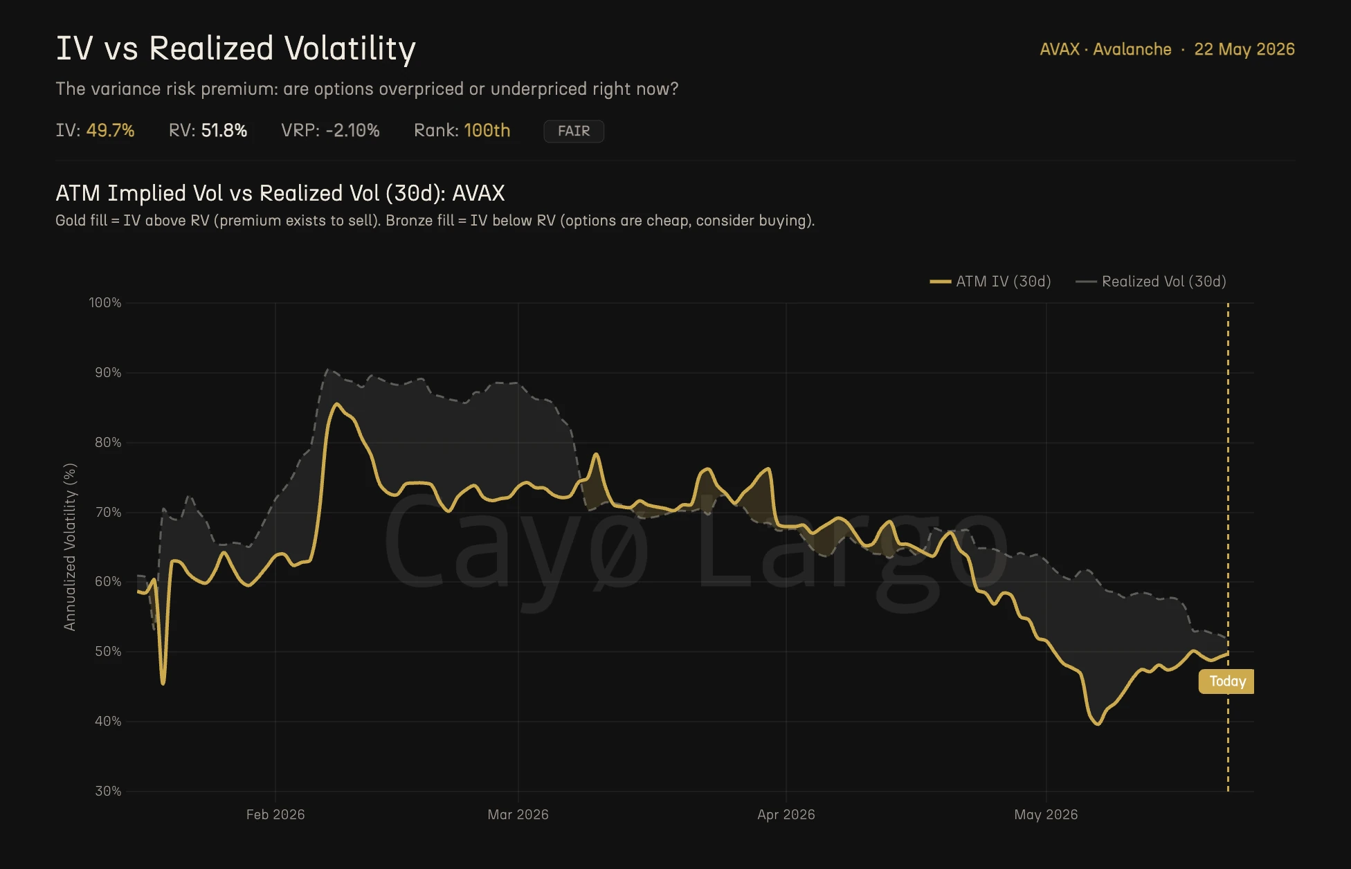
Figure 1: ATM Implied Vol vs Realized Vol (30d) for AVAX over 6 months. Gold line is ATM IV. Grey dashed line is RV. Gold fill where IV sits above RV (premium exists to sell). Bronze fill where IV drops below RV (options are cheap, consider buying).
Two lines. One gold, one grey dashed. The gold line is 30-day ATM implied volatility. The grey dashed line is 30-day realized volatility. Where they sit relative to each other is the entire story.
The shaded areas between the lines make this instant to read. Gold fill means IV is above RV and premium exists. The options market is pricing more movement than what's happening. This is the environment where systematic premium selling strategies tend to work. Bronze fill means IV is below RV and options are cheap. The market is underpricing actual movement. Buying protection or going long volatility has a statistical edge.
Look at the AVAX chart for the last six months. From January through mid-April, both lines trended down together in a long grind from 90% to around 50%. RV (the dashed line) generally tracked above IV for most of that period, with a lot of bronze fill. That means for months, AVAX was moving more than the options market expected.
Then look at what happened in early May. Both lines drop hard, IV touching 42% before bouncing. That's the kind of vol compression that happens after a sustained calm period. RV lagged behind, staying above IV. Right now, as of May 22, IV reads 49.7% and RV reads 51.8%. The grey dashed line sits above the gold line. Bronze fill. Options are still cheap relative to actual movement.
The big takeaway from this chart is that direction and crossovers matter more than absolute levels. IV at 50% might sound high compared to S&P 500 options (where 20% is a normal day), but for AVAX it's in the lower range of its 6-month history. Context is everything.
Chart 2: The Variance Risk Premium
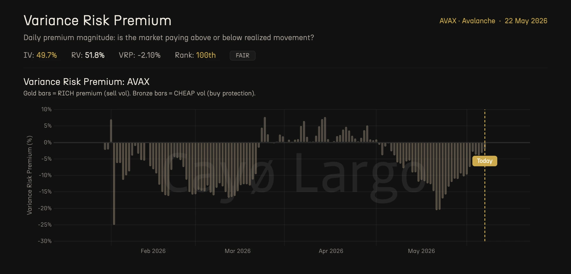
Figure 2: Variance Risk Premium for AVAX. Gold bars mark RICH premium (sell vol). Bronze bars mark CHEAP vol (buy protection). Current VRP at -2.10%.
The second chart strips away the lines and gives you just the gap. Each bar represents one day's VRP, the difference between IV and RV.
Positive bars (gold, above zero) mean IV exceeds RV. The options market is pricing in more movement than what's occurring. This is when selling premium has a statistical edge because you collect the spread between fear and reality.
Negative bars (bronze, below zero) mean RV exceeds IV. The market is undercharging for actual movement. Buying options is the historically favorable trade because you're paying less than what the underlying is delivering.
AVAX has been running negative most of the last six months. Look at the February-March stretch, sustained bars between -5% and -30%. That's a prolonged period where anyone systematically selling strangles or iron condors on AVAX was, on average, getting run over. RV was consistently blowing past what IV predicted.
The current reading is -2.10%. Small. Almost zero. This is what the platform labels as FAIR, no strong edge in either direction. The gap between expectation and reality has compressed to noise.
But here's the part most traders miss. The magnitude matters, but so does the context. A -2.10% VRP after months of -15% to -25% bars is a very different signal than -2.10% after months of +5% bars. The first is a recovery toward equilibrium. The second is a deterioration. AVAX is the first case. That matters for Chart 3.
Chart 3: VRP Historical Percentile
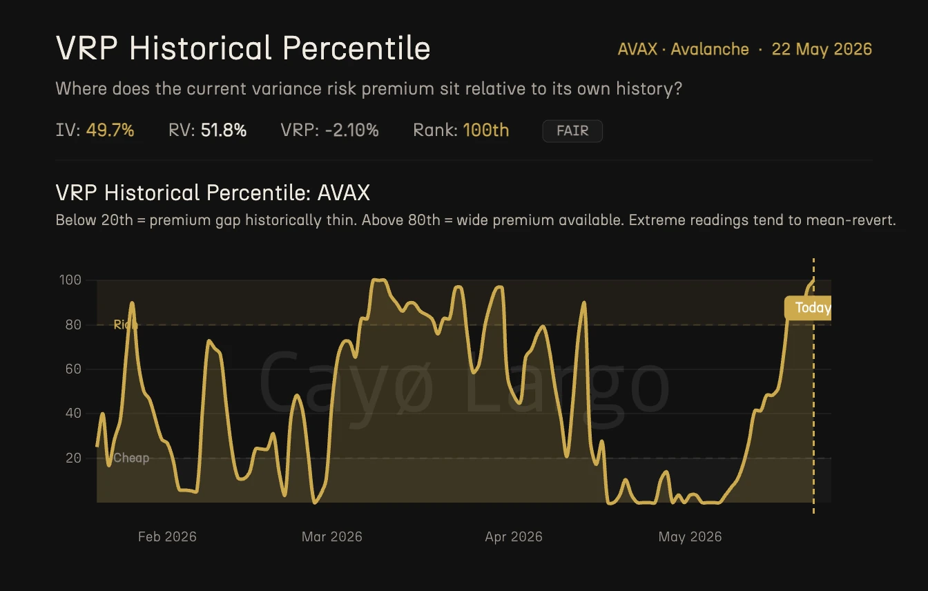
Figure 3: VRP Historical Percentile for AVAX. Current reading at 100th percentile. Above 80 is the Rich zone (wide premium). Below 20 is the Cheap zone (thin premium). Extreme readings tend to mean-revert.
This is the chart that ties it all together. The raw VRP number (-2.10%) tells you what's happening today. The percentile tells you how unusual today is compared to the recent past.
The percentile ranks the current VRP against its own lookback window. If AVAX has been running -10% to -25% for months and today it reads -2.10%, that -2.10% is actually the richest the premium has been in a long time. It sits in the 100th percentile. Not because the premium is objectively large, but because it's the least negative it has been.
Two zones are marked on the chart.
Above 80th percentile (Rich zone). The premium is historically wide. IV is elevated relative to RV more than usual. This is where selling premium has the strongest statistical edge, and where extreme readings tend to snap back.
Below 20th percentile (Cheap zone). The premium is historically thin. IV is low relative to RV. Buying options is the statistically favorable trade, and again, extremes tend to revert.
AVAX at the 100th percentile, at first glance, sounds like a screaming signal to sell vol. But read it carefully. The VRP is -2.10%, which means IV is still slightly below RV. The percentile is telling you the premium has recovered to its richest point relative to recent history, but the absolute level is FAIR, not RICH. It's like saying "this is the best it's been in months, and it's still only break-even."
That's a nuance a lot of quick-read tools miss. The regime says FAIR. The percentile says 100th. Both are true. Both matter.
The Math Behind It
We've already defined VRP. Let's formalize the pieces.
Implied volatility is extracted from ATM option prices using the Black-76 model (Deribit's standard).
where is the forward price, is the strike, is time to expiry, is the risk-free rate, and is the cumulative normal distribution. IV is the that makes this equation match the observed market price. You solve it numerically (Newton-Raphson, bisection, or Brent's method). The 30-day ATM IV shown on these charts uses the nearest-to-ATM strikes on the nearest-to-30-day expiry.
Realized volatility is the annualized standard deviation of log returns over a rolling 30-day window.
where is the spot price at close of day , and is the number of observations in the window (typically 30). The 252 factor annualizes from daily to yearly. Some implementations use in the denominator (Bessel's correction). The difference is tiny at .
The VRP percentile ranks today's VRP against the rolling lookback window.
where is the set of historical VRP observations in the window. A 100th percentile means no observation in the lookback exceeded today's value.
Reading All Three Charts Together
This is an educational walkthrough, not a trade recommendation. It shows how a trader might interpret these charts. Your own analysis, risk tolerance, and market view should drive every decision you make.
Let's walk through how someone might read these three charts on AVAX as of May 22 and what questions they raise.
Step 1. Read the regime. The header on all three charts says FAIR. That means the gap between IV and RV is small. No strong statistical tilt in either direction. A transition zone.
Step 2. Check the time series (Chart 1). IV at 49.7%, RV at 51.8%. Bronze fill. IV sits below RV but the gap is closing. Both lines are bouncing off their 6-month lows. The trend is compression turning to expansion, vol waking up after the May dip.
Step 3. Read the VRP bars (Chart 2). The current bar is -2.10%. Barely negative. Compare to the last few weeks, where bars had been ticking up from deeply negative territory. The premium gap has been narrowing.
Step 4. Check the percentile (Chart 3). 100th percentile. This confirms what the bars show. The premium is at its richest point in the lookback window. But "richest" here means "least negative," not "positive."
Step 5. Ask the right questions. Three observations sit on the table at once.
| • | IV is still below RV (historically, this regime has favored option buyers over sellers) |
| • | The gap is closing fast (that statistical tilt is shrinking) |
| • | The percentile is at an extreme (extreme readings tend to mean-revert, which would push the VRP back down) |
A trader focused on premium selling might look at this and decide the conditions don't support opening a new short-vol position. The premium simply isn't wide enough. Someone focused on buying protection might note that the window where options are statistically cheap is narrowing but still open.
A hypothetical thought process. Suppose a trader believes AVAX will continue to move more than the market expects (the trend of the last four months). They want long volatility exposure but want to limit their outlay. One structure they might consider is a 30-day ATM straddle. The logic would go something like this.
| • | The current IV (49.7%) is what they'd pay. If RV stays above IV over that window, the straddle profits from realized moves exceeding the implied cost. The VRP percentile at 100 tells them the entry point is the least expensive it's been in the lookback window relative to history. |
| • | A FAIR regime with no clear statistical edge would suggest modest sizing. The signal is ambiguous, so the position size should reflect that. |
| • | A natural review point would be the VRP percentile dropping below 80 (meaning the premium gap is widening again) or the regime flipping to RICH (IV moving above RV convincingly), which would change the thesis entirely. |
That's three charts, five minutes of reading, and a structured thought process. Not a prediction. Not advice. A framework for asking better questions.
What These Charts Don't Tell You
IV vs RV is the foundation, but it's one dimension. Here's what's missing from these three charts alone.
Skew. Are puts or calls richer? A flat VRP can hide a market where puts are expensive and calls are cheap (or vice versa). Skew analysis tells you which side of the chain carries the premium.
Term structure. We're looking at 30-day measures. The 7-day VRP could tell a completely different story. A flat 30-day VRP with a deeply negative 7-day VRP means short-term movement is outpacing expectations even if the monthly view looks balanced.
Gamma exposure. The IV vs RV chart tells you whether options are priced fairly. It doesn't tell you what dealer hedging will do to the price. That's what the GEX analysis covers (see our previous article on BTC gamma exposure).
Flow intelligence. Are institutions buying or selling that vol? Raw IV doesn't distinguish between a single whale hedging a portfolio and a thousand retail traders speculating. Trade tape forensics does.
Event proximity. A FAIR VRP reading the day before a protocol upgrade means something different than a FAIR reading on a quiet Tuesday. Context from the broader crypto calendar matters.
Each of these is a separate layer of analysis. Cayø Largo computes all of them.
Where to Find This on Cayo Largo
Every chart in this article comes from the IV vs RV page under the Volatility Landscape section. It updates every 10 minutes, across all six coins we cover, BTC, ETH, SOL, XRP, AVAX, and TRX.
You get the full IV vs RV time series with color-coded fill, the daily VRP bar chart, the VRP historical percentile with Rich/Cheap zones, the regime label (RICH / FAIR / CHEAP), and the percentile rank. All of it. The next time someone asks you "are AVAX options expensive right now?", you won't have to guess. Three charts, 30 seconds, and you'll know where the premium stands and what history says about it.
Frequently Asked Questions
What is the variance risk premium in crypto options?
The variance risk premium (VRP) is the difference between implied volatility (what the market expects) and realized volatility (what actually happened). When IV is higher than RV, sellers collect a premium for taking on uncertainty. When IV is lower than RV, options are cheap relative to actual market movement.
What does it mean when IV is below realized vol?
When implied volatility is below realized volatility, options are underpriced relative to how much the underlying asset is actually moving. This is called a negative VRP. Selling premium in this regime has historically produced negative returns because the market is moving more than option prices reflect.
How do you use the VRP percentile to trade?
The VRP percentile ranks the current premium gap against its own recent history. Below the 20th percentile, the premium is historically thin, meaning conditions favor buying options. Above the 80th percentile, the premium is historically wide, meaning conditions favor selling premium. Extreme readings tend to mean-revert.
Why does AVAX show a FAIR regime when the VRP percentile is at 100th?
The regime label reflects the raw VRP level: at minus 2.10 percent, the gap between IV and RV is small enough to be classified as FAIR. The percentile, however, measures where that gap sits relative to its own history. A 100th percentile FAIR means the premium is the richest it has been in the lookback window, even though the absolute gap is small. Both signals matter.
What is the difference between implied volatility and realized volatility?
Implied volatility is the market's forward-looking estimate of how much an asset will move, extracted from option prices. Realized volatility measures how much the asset actually moved over a past period. Comparing the two tells you whether the market is over-estimating or under-estimating future movement.
Is implied volatility usually higher than realized volatility in crypto?
Yes, roughly 85 pct of the time in Bitcoin. This persistent gap is the variance risk premium. Option sellers collect it as compensation for bearing uncertainty. In crypto the gap is structurally larger than in equities because of tail risk, 24/7 trading, and thinner liquidity. A typical Bitcoin VRP runs 10 to 15 annualized points above realized vol, compared to about 2 points for the S&P 500.
How do you read a crypto volatility chart?
An IV vs RV chart plots two lines over time. The gold line is implied volatility (what the market expects) and the dashed line is realized volatility (what actually happened). When the gold line sits above the dashed line, options are expensive relative to actual movement. When it sits below, options are cheap. The shaded area between the lines shows the size and direction of the gap at a glance.
Related Articles
Why Crypto IV Spikes Before Expiry: The Bow Shock
Why does crypto implied volatility spike before expiry? An IV Footprint heatmap shows a bow-shaped front flaring at the wings before each Deribit settlement.
How to Read Gamma Exposure: Bitcoin GEX Live Case Study
BTC trades at $77,140 with $51 million in put open interest stacked at $76,000 and the gamma regime deep in negative territory. Expiry is 16 hours away. Here's how to read every chart on the GEX Landscape page and what each one tells you about what happens next.
Why Knowing Your Greeks Won't Save You on Deribit
You learned Delta, Gamma, Theta. You can explain Black-Scholes over coffee. Then you open Deribit's options page and none of it helps. Here's why options theory breaks down on a live screen.