The Crypto Leverage Effect, Measured Coin By Coin
The crypto leverage effect holds on Bitcoin 72.2% of the time and on XRP 55.8%. Six months of implied volatility measured against price, coin by coin.
Ask a crypto desk what implied volatility (IV) does when the coin drops 2% and the answer comes back without a pause. It goes up. On Bitcoin that answer is right 72.2% of the time. On XRP it is right 55.8% of the time, which is close enough to a coin toss that nobody would build a hedge on it.
Same rule, same six months, same measurement. A gap of more than 16 points. That gap is the finding. Across 497 qualifying down days and 441 up days on Cayø Largo's own volatility surface, the received relationship turns out to be real, weaker than it is usually stated and not the same relationship on every coin.
In this note we count both halves of the rule, coin by coin, then take the count to all six coins including the thin one. After that we set the numbers beside what practitioners were already writing about the same asymmetry and we say plainly which of the two explanations for it we cannot separate.
The rule and its two halves
The leverage effect was named in equity markets. There it is strong, stable and well documented. It says two things rather than one. When price falls, implied volatility rises, because participants get nervous on the way down and bid the protection that options provide. When price rises, implied volatility drains away again.
Crypto inherited the assumption largely intact. A rule carried from one market into another is a plant moved to a new continent. It may take. It may sulk. Only a season of watching settles which.
Nobody watched. A Genesis desk commentary published on Deribit Insights in November 2022 described negative spot-vol correlation as the market's rational expectation and priced its whole view of skew from it. Tony Stewart's option flow notes from July 2022 track the same expectation in its tradeable form, namely put skew firming and weakening week by week. That is a reasonable place to start. The question here is narrower and, as far as we can tell, unpublished: how often is it actually true, per coin, when you count.
The textbook corner and who stands in it
For every day a coin moved 2% or more, in either direction, the test asks whether its short-dated implied volatility did what the rule says. The first column is the falling half, what share of down days saw implied volatility rise. The second is the rising half, what share of up days saw it fall. A coin whose volatility ignored its own price would sit at 50 on both.
What the count measures is a conditional frequency, one per coin and one per half of the rule.
where is the 7-day at-the-money implied volatility read at a fixed hour on day , is the coin's price at that same hour, is the set of qualifying down days and its size and is the indicator that returns one when the condition holds and zero otherwise. The rising half is the mirror image, counting over the days a coin gained 2% or more. A book whose volatility ignored price entirely would return on both halves.
| Coin | Down day, IV rose | Up day, IV fell | Down days | Up days |
|---|---|---|---|---|
| BTC | 72.2% | 65.7% | 72 | 70 |
| AVAX | 59.8% | 67.5% | 97 | 77 |
| ETH | 61.1% | 56.3% | 108 | 103 |
| SOL | 57.8% | 57.1% | 116 | 112 |
| XRP | 55.8% | 55.7% | 104 | 79 |
| Pooled | 60.6% | 59.9% | 497 | 441 |
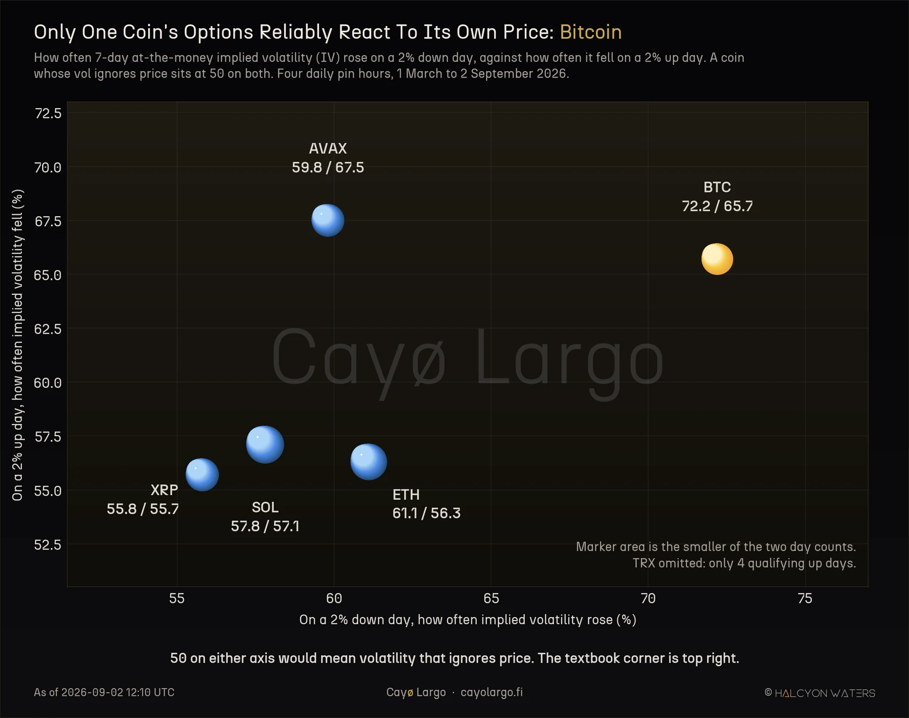
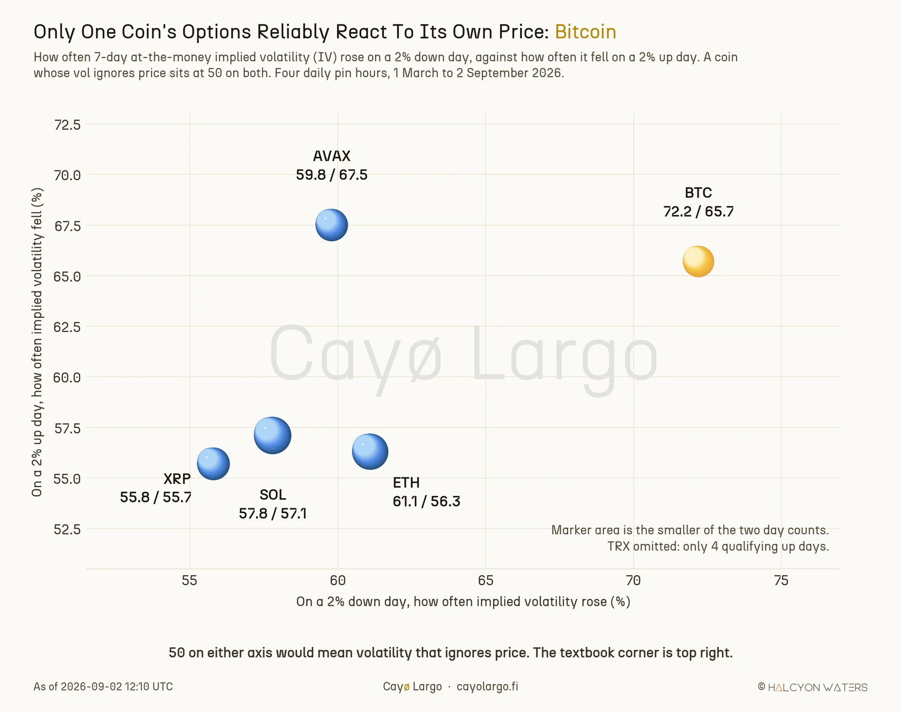
Figure 1: Both halves of the rule on one plate. The horizontal axis is the falling half, the vertical axis the rising half and a coin whose volatility ignored price would sit at 50 on both. The textbook corner is upper right, where only Bitcoin sits. Marker area is the smaller of a coin's two day counts, so a thinly sampled coin draws a smaller dot. TRX is omitted here, with only four qualifying up days.
Bitcoin is the only coin in the set clear of 60% on both halves. XRP, at 55.8% and 55.7%, is near enough indistinguishable from a book that pays no attention to price at all. The four coins between them cluster tightly, 55.8% to 61.1% on the falling half and that ordering has held for the full six months rather than drifting about.
One reading deserves separating out, because it cuts against the easy story. AVAX is the strongest coin in the set on the rising half, at 67.5%, ahead of Bitcoin's 65.7%. Bitcoin does not dominate both measures. It is the only coin strong on both at once, what is a different and narrower claim.
The same measure across all six coins
The falling half alone carries enough observations to include TRX, whose 16 qualifying down days are thin but reportable. Read as the complement, namely the share of down days on which implied volatility fell instead of rising, the ordering inverts and the spread is easier to see.
where is the share of qualifying down days on which short-dated implied volatility went the wrong way. Bitcoin's 72.2% and 27.8% are one measurement read from its two ends.
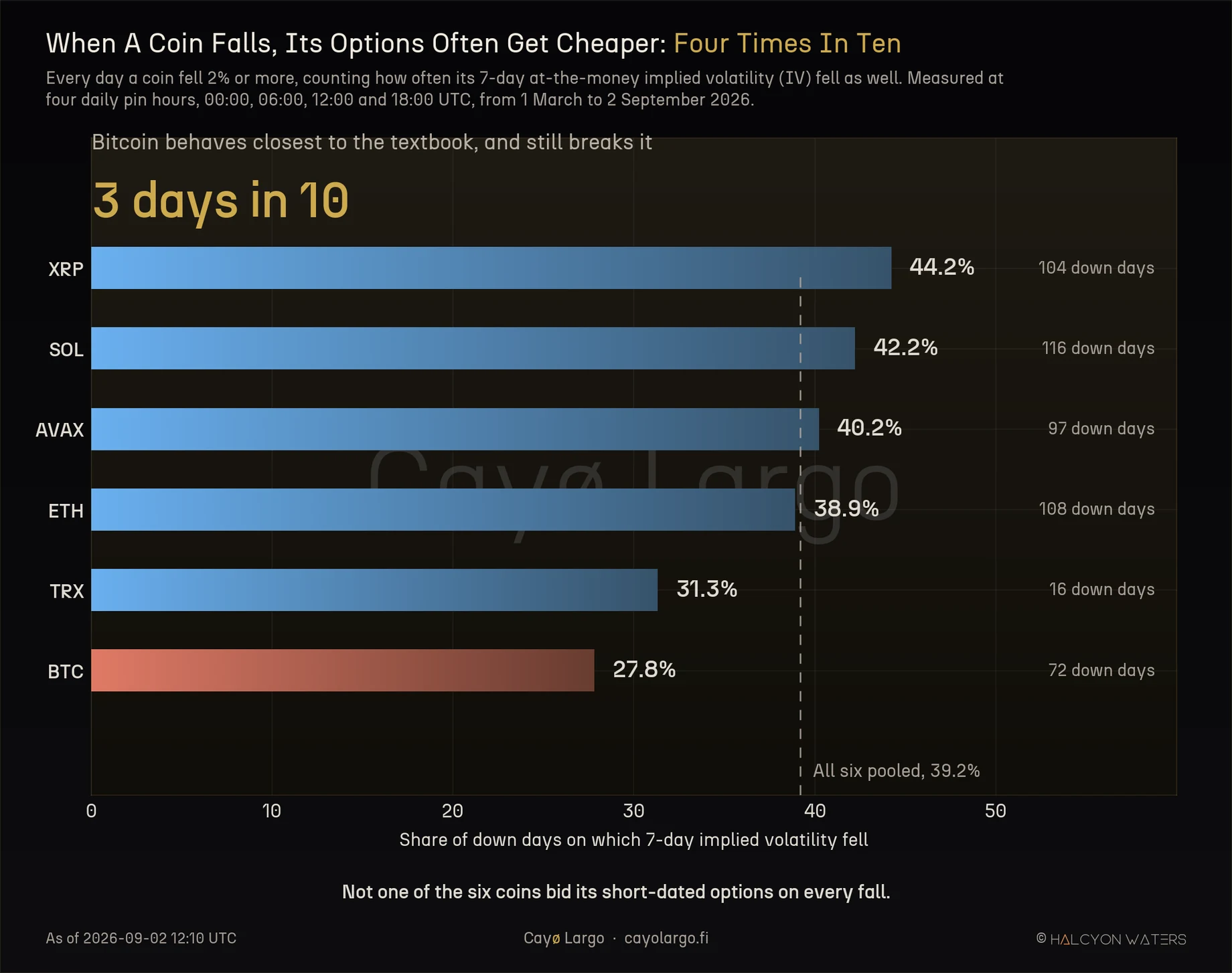
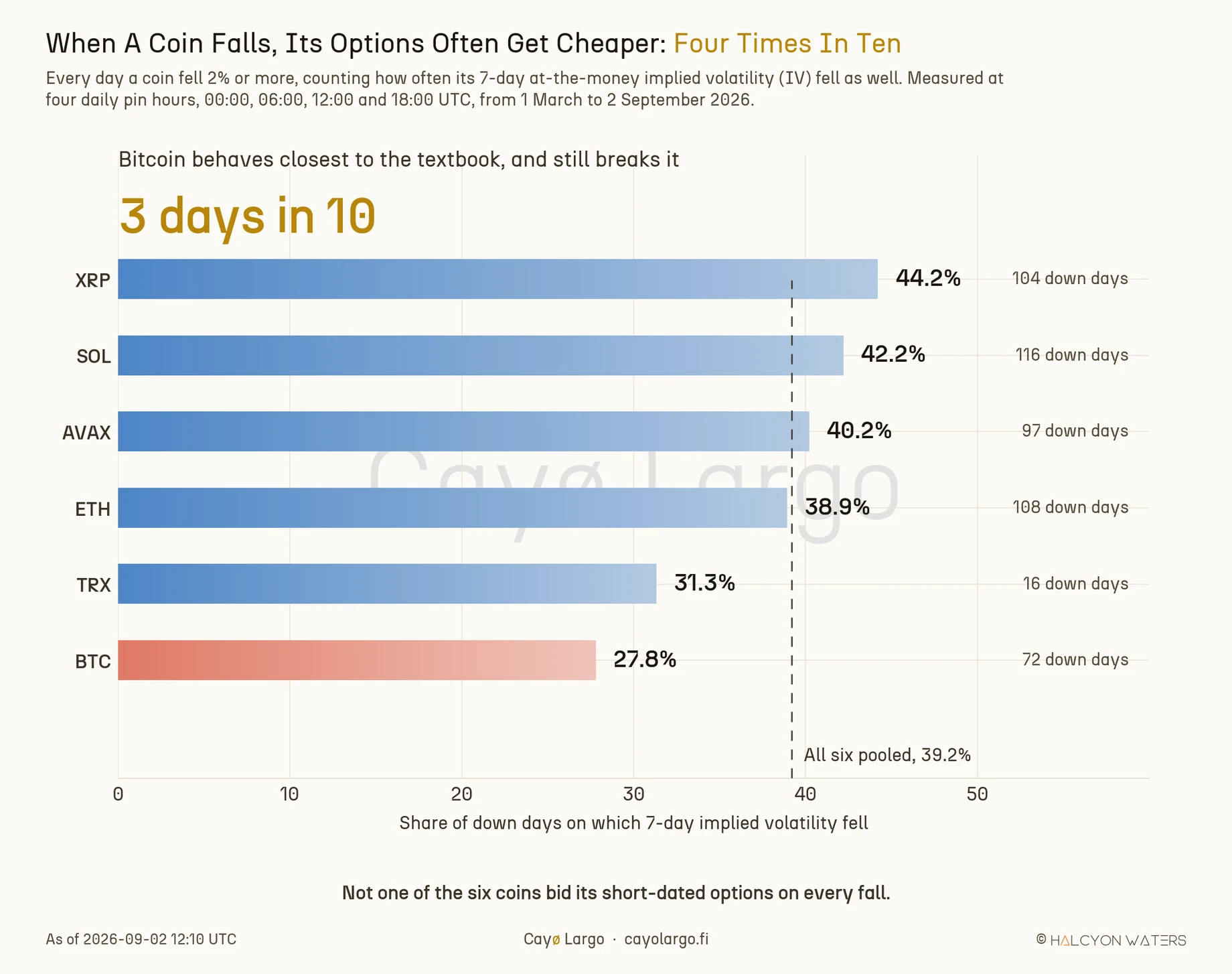
Figure 2: The falling half only, stated as the share of down days on which short-dated implied volatility went the wrong way. All six coins, TRX included at 16 down days. The dashed line is the six-coin pooled figure of 39.2%. Bitcoin at 27.8% is the most textbook coin in the set and still moves against the rule nearly three days in ten.
Have a look at where Bitcoin lands. At 27.8% it is the most textbook coin in the set and it still goes the wrong way nearly three days in ten. The pooled figure across six coins is 39.2%. Four days in ten, the rule that a desk prices skew from does the opposite of what it promises.
Practitioners saw the asymmetry before anyone counted it
The finding is not a surprise sprung on the market. It is a number put to something experienced traders had already noticed and written down.
Imran Lakha, writing on Deribit Insights in November 2023, described a market where call premium dominated the curve on both BTC and ETH. He attributed traders' willingness to buy a flat call skew to what he called the "consistent positive correlation between spot and volatility throughout the year". Positive spot-vol correlation is the leverage effect running backwards. In that state a rally bids volatility rather than draining it.
Three weeks earlier, the same author recorded the opposite configuration: BTC skew tilting to puts across every duration out to three months, while longer tenors kept a call bias that had persisted for months. Read the two together and they describe a market that switches between the textbook regime and its inverse. Different speeds on different coins and different parts of the curve.
That switching was visible and documented. What was missing was a base rate.
How this was measured
The implied volatility readings come from atm_iv_dte_7, the 7-day at-the-money point on Cayø Largo's own volatility surface, rebuilt from Deribit every ten minutes and published through the vol surface endpoints. Spot comes from the underlying price carried on the gamma-exposure pinning table, what covers all six coins where the spot market-data table carries only three.
Each coin's series was reduced to one reading per day at a fixed hour. A day qualifies only when the previous calendar day carries a reading at the same hour, so no comparison spans a gap. The window runs from 1 March to 2 September 2026. Taker-flow-derived columns are empty for February despite the partitions opening on 1 February, which is why the window starts in March.
The whole count was then run four times over, at 00:00, 06:00, 12:00 and 18:00 UTC and pooled. That was forced on us by an artefact rather than chosen for elegance. The first version used the 12:00 UTC snapshot alone and returned 17.4% for Bitcoin on the falling half, against 27.8% across the four pin hours. A 10-point swing out of the choice of reading time is a property of the clock. Not of the market. Treat any single-pin version of this measurement as unreliable, including ours. The live version of the surface these readings come from is on the Volatility Landscape.
What this does not say
It counts the direction of the volatility move and not its size. A drift of 0.1 volatility points scores the same as a 9 point collapse. The table says how often the relationship holds and nothing about what it is worth when it does.
It does not condition on where implied volatility started. Mean reversion out of an elevated front end is a live competing explanation for the weaker coins and we have not ruled it out. That distinction matters, because the two stories predict different skew paths on the same day. Separating them is the obvious next test rather than a settled result. Our variance risk premium guide covers the related question of implied against realised volatility, which is a different measurement and should not be read as this one.
The four pin series each avoid overlap internally and they cover the same calendar, so they are correlated with one another. The pooled counts are not as many independent observations as they look. TRX carries 16 down days and 4 up days, so the down-day figure is reportable with care and the up-day figure is not reported at all.
And the mechanism is unestablished. Two explanations fit the spread between Bitcoin and XRP. The smaller coins may attract more speculative upside positioning, so that a selloff deflates call demand rather than bidding downside protection. Or their front ends may simply start richer and have further to fall, what would make the effect a repricing toward normal wearing a leverage-effect costume. A direction count cannot tell them apart.
What to watch
A desk pricing or hedging a crypto vol book off an assumed spot-vol sign is carrying a weaker assumption on the smaller coins than on Bitcoin and the gap is 16 points wide. The reading worth tracking next is the skew path on the days the rule breaks, because that is where the two candidate explanations stop agreeing with each other.
An inherited rule is not a law until somebody counts. Count it on your own book, one coin at a time. See which half it keeps.
References
- Tony Stewart, 14 July 2022, Option Flow, Week 28, Deribit Insights: put skew firming and weakening through the year, the leverage-effect expectation in tradeable form. https://insights.deribit.com/option-flows/option-flow-week-28-2022/
- Genesis, 30 November 2022, Desk Commentary: Option Market Dynamics, Deribit Insights: negative spot-vol correlation described as the market's rational expectation, with skew priced from it. https://insights.deribit.com/industry/desk-commentary-option-market-dynamics/
- Imran Lakha, 11 October 2023, Front End Skews Shift to Put Preference, Deribit Insights: BTC skew tilting to puts out to three months while longer tenors keep a call bias. https://insights.deribit.com/industry/front-end-skews-shift-to-put-preference/
- Imran Lakha, 1 November 2023, Crypto Options: Call Premium Everywhere, Deribit Insights: call premium across the curve, attributed to a positive correlation between spot and volatility. https://insights.deribit.com/industry/crypto-options-call-premium-everywhere/
Cayø Largo data referenced throughout: 7-day at-the-money implied volatility and underlying price, six coins, 1 March to 2 September 2026, ten-minute cadence, sampled at four daily pin hours. Field definitions are published in the volatility surface API documentation.
Frequently Asked Questions
Does implied volatility always rise when crypto falls?
No. Measured across six months of Cayø Largo's own volatility surface, a 2% or larger daily fall was followed by higher 7-day at-the-money implied volatility 72.2% of the time on Bitcoin but only 55.8% of the time on XRP. Pooled across five coins, 497 down days, the figure is 60.6%. The relationship is real and it is much weaker than the textbook implies.
What is the leverage effect in crypto options?
The leverage effect is the observed tendency for implied volatility to rise as spot falls and to fall as spot rises. It was named in equity markets, where it is strong and stable. Crypto inherited the assumption. The measurements here show it holds on Bitcoin and weakens sharply across the smaller coins, where it approaches a coin flip in both directions.
Which crypto coin has the weakest volatility response to price?
Of the five coins with enough observations to measure, XRP is the weakest. Its 7-day at-the-money implied volatility moved the textbook way on 55.8% of qualifying down days and 55.7% of qualifying up days, against a 50% baseline that would mean volatility ignoring price entirely. Bitcoin is the only coin in the set clear of 60% on both halves.
Why measure at four pin hours instead of one?
Because a single reading time can produce an artefact. Taking only the 12:00 UTC snapshot gives a very different Bitcoin figure than the four-hour average, which is a property of the sampling clock rather than of the market. Running the same count at 00:00, 06:00, 12:00 and 18:00 UTC and pooling the four series removes that dependence.
Related Articles
Crypto Variance Risk Premium: Live IV vs RV on Six Coins
How to read IV vs RV charts and the variance risk premium to figure out whether crypto options are overpriced, underpriced, or fairly valued. Live AVAX example from Deribit.
Why Crypto IV Spikes Before Expiry: The Bow Shock
Why does crypto implied volatility spike before expiry? An IV Footprint heatmap shows a bow-shaped front flaring at the wings before each Deribit settlement.
Why Deep-OTM IV Momentum Is Noise, Not Signal
A stable IV smile but wild IV momentum at deep-OTM strikes. Why thin-strike microstructure is noise, not repricing, shown live on Deribit multi-coin data.