When Is The Crypto Front Week Actually Cheap?
Options traders read an inverted vol curve as a warning. Across 830 crypto days it was calm contango, not backwardation, that priced the front week best.
Every options trader has felt the tilt. That particular shape where the front week prices above the quarter, and the market stops pretending risk is spread evenly across the horizon. Textbooks call it backwardation; desks call it a warning. You buy the front week if you must and you do not sell it lightly.
Across 830 coin-days that warning has been worth less than its price, and the cheapest week sits at the other end of the curve. When the term structure is in its steepest contango, the boring shape nobody watches, the following week delivered more volatility than the front option charged 75.0% of the time. In the mildly inverted middle that figure is 44.7%. Traders already fluent in term structure and realized volatility can jump straight to "The answer is a curve, not a cliff".
First, what a term structure is
An option expiring on Friday and one expiring in three months rarely carry the same volatility price. Plot the at-the-money implied volatility of each expiry against its distance in time and you get the term structure, the market's price list for uncertainty at different horizons.
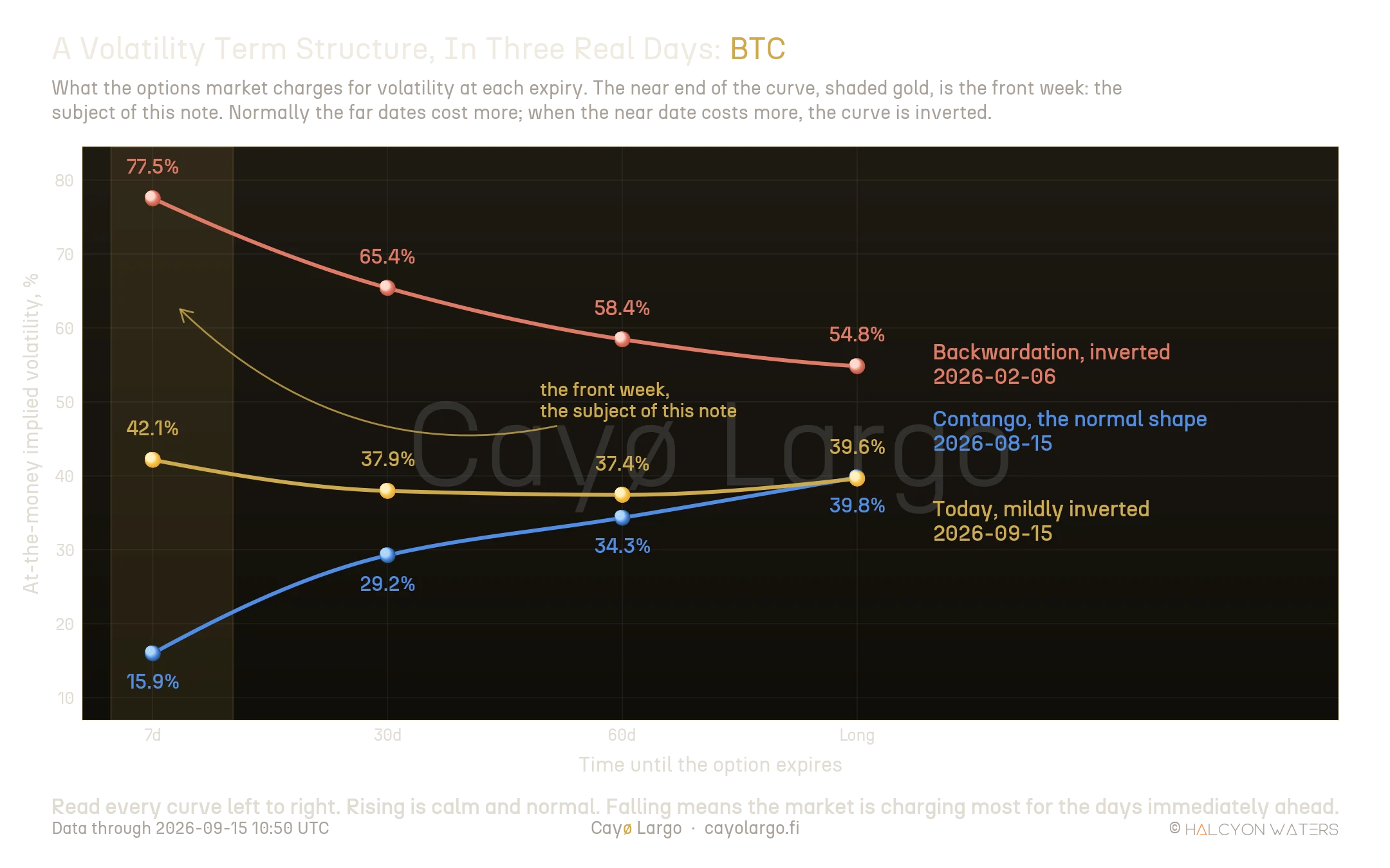
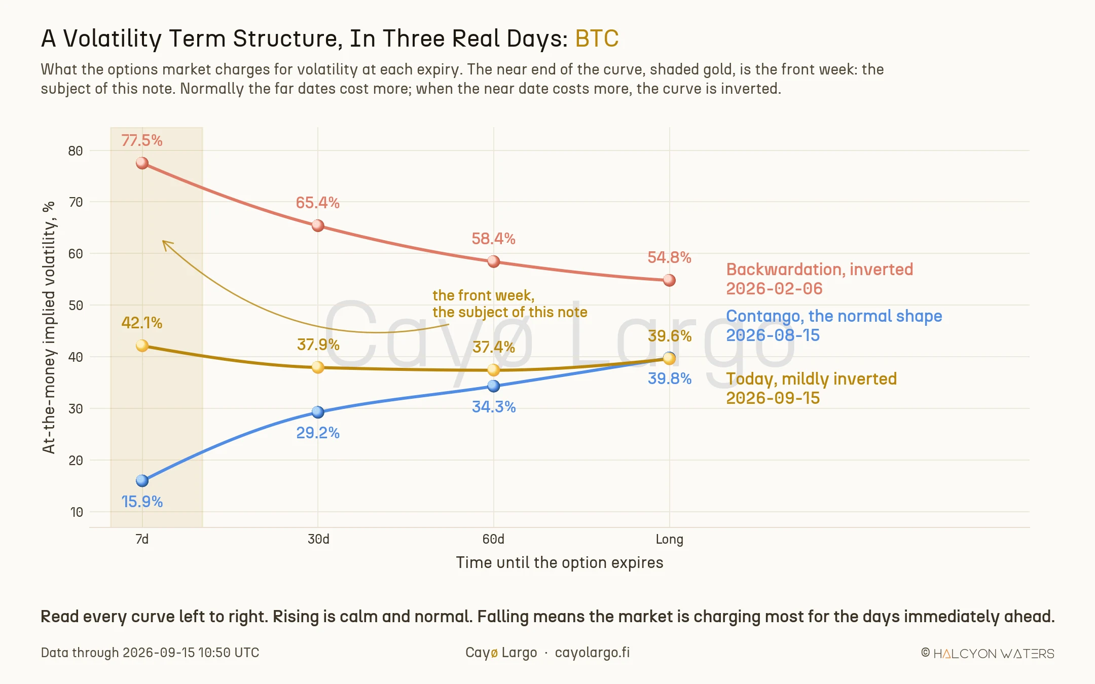
Figure 1: Three real Bitcoin days. The gold band marks the front week, the article's subject. Rising left to right is contango, the normal state; falling is backwardation.
Almost always it slopes up. On 15 August Bitcoin charged 15.9% for the next week and 39.8% for the long expiry, the normal state, called contango. The far dates cost more because more can happen in three months than in seven days.
Sometimes it flips. On 6 February the same book charged 77.5% for the week ahead and 54.8% for the long expiry. That is backwardation. The market is saying the danger is not spread evenly across the horizon: it is concentrated in the days directly in front of you.
That is what the shape is. What it means is where the field splits. Amberdata, working through four years of Bitcoin, found the curve in contango almost 77.5% of the time and treats the flip as a reaction to shocks. Brett Friedman (2025), writing for OptionMetrics, found the VIX futures curve backwardated on 18.8% of days since 2006, concentrated in the financial crisis and the pandemic. Imran Lakha (2024) once caught one forming ahead of the ETF deadline, before anything had happened at all. Three readings of the same shape, and the measurement that follows adds a fourth.
What the market charged against what it got
Two numbers run through everything below and they are easy to mix up.
Implied volatility is a price, what the market charges today for the week ahead. Realized volatility is a measurement, how much the coin actually moved, computed after the fact:
where is the spot price at observation and is the number of observations in the trailing seven days. Crypto annualizes on 365 rather than 252, namely because the market never closes.
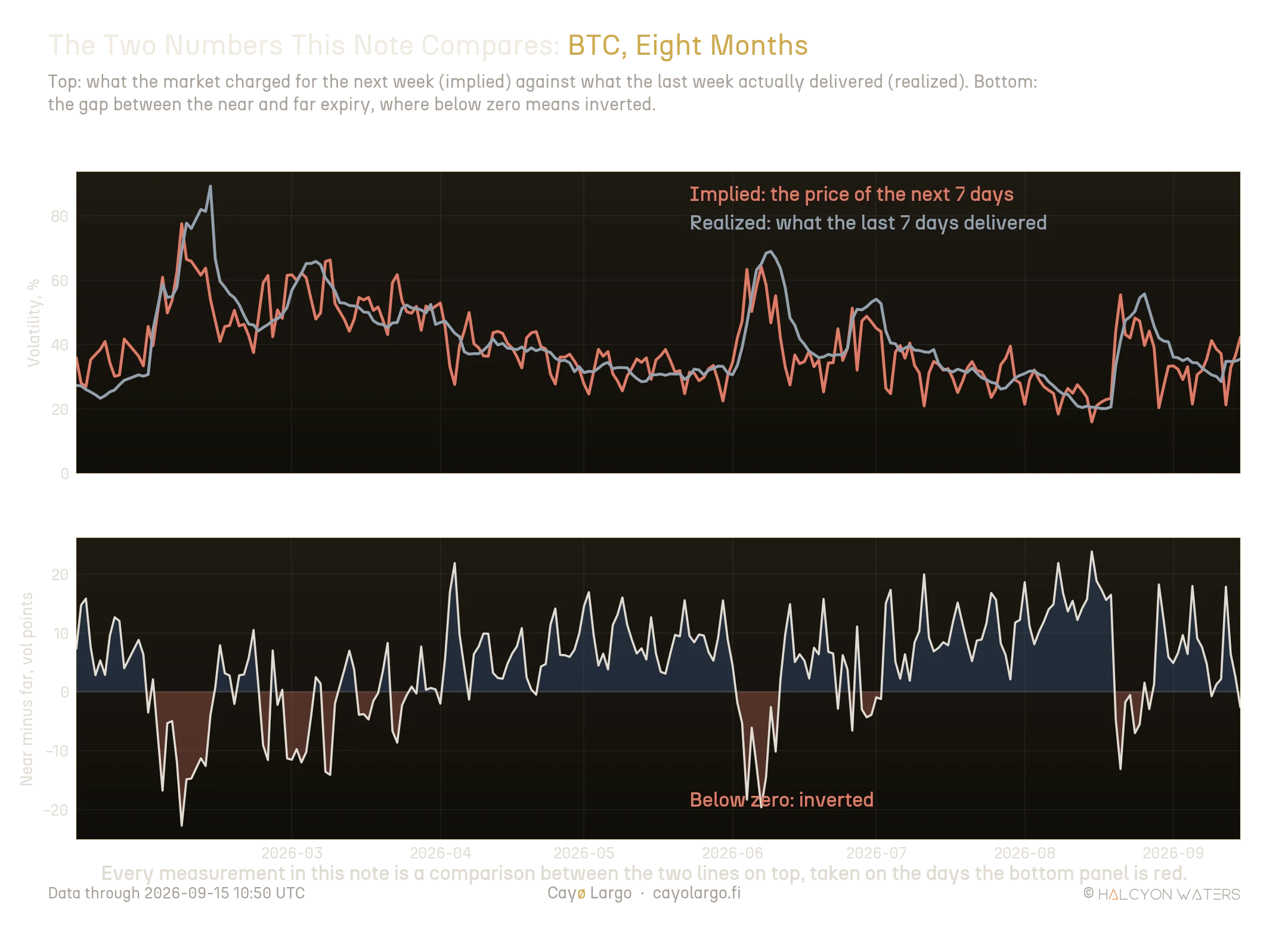
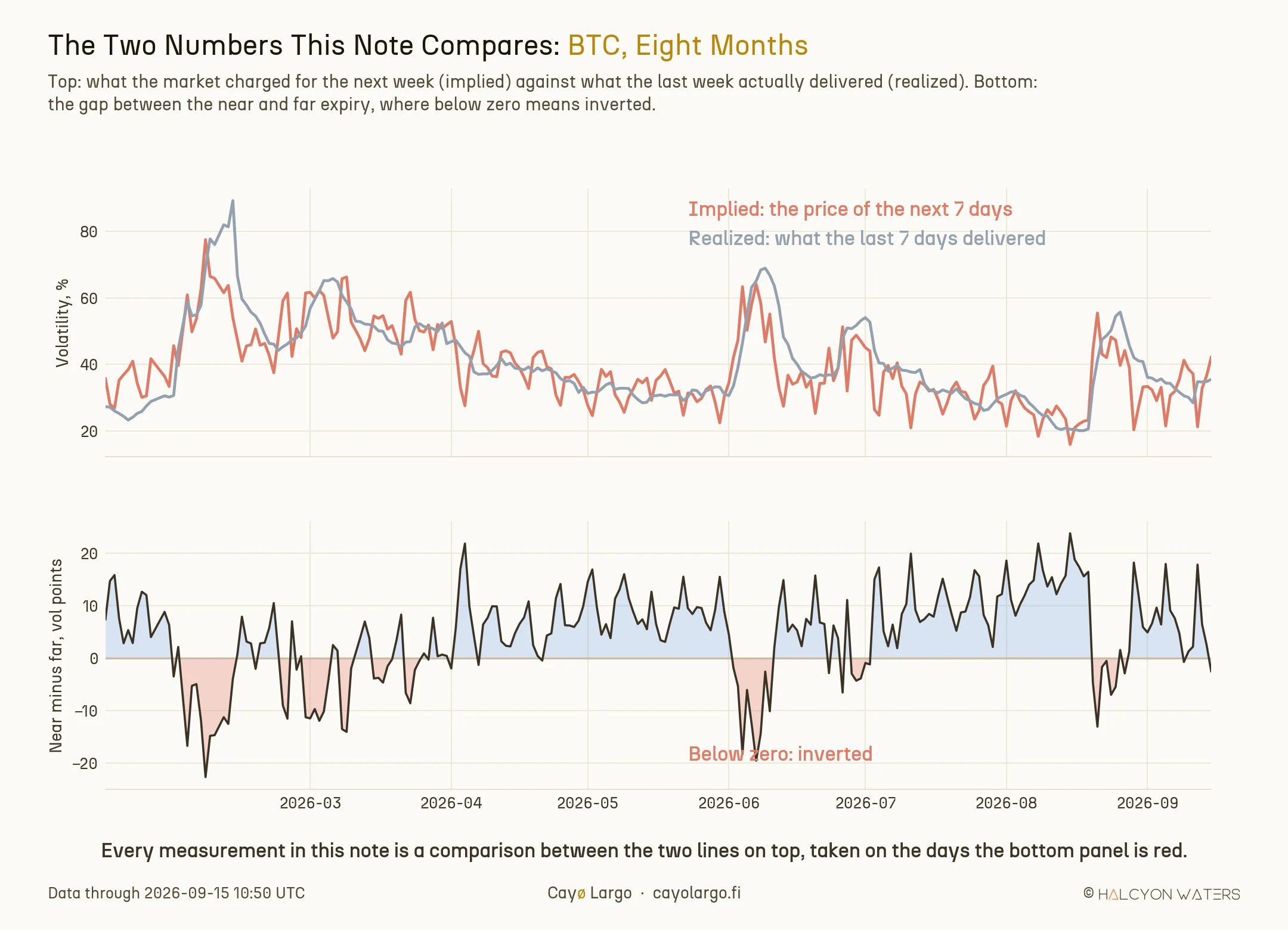
Figure 2: Top: the price of the next week against what the last week delivered. Bottom: the near expiry minus the far one, red wherever the curve is inverted.
One is the bill, the other is what you got for it. The whole note is one question asked 830 times: was the bill worth paying? A day counts as worth its price when the volatility that showed up over the next seven days came in above the implied the option was carrying that morning.
Every coin is ranked against its own history
Raw volatility points do not travel between coins. XRP's spread swings several times wider than Bitcoin's, so a threshold that marks a crisis on one book is an ordinary Tuesday on the other. Each day is therefore placed by rank within its own coin's distribution.
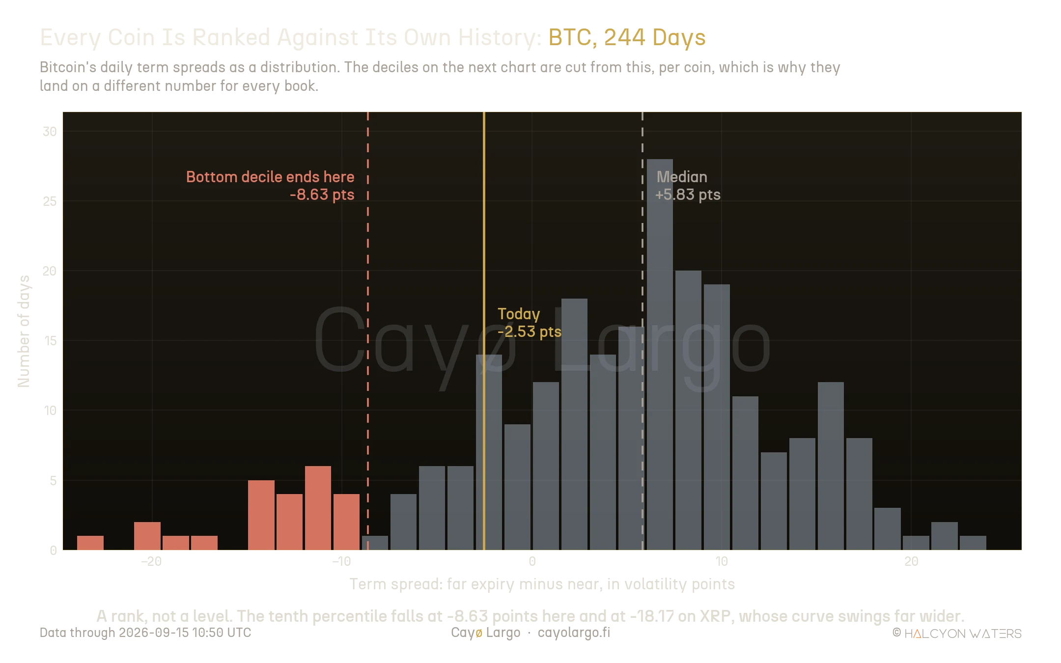
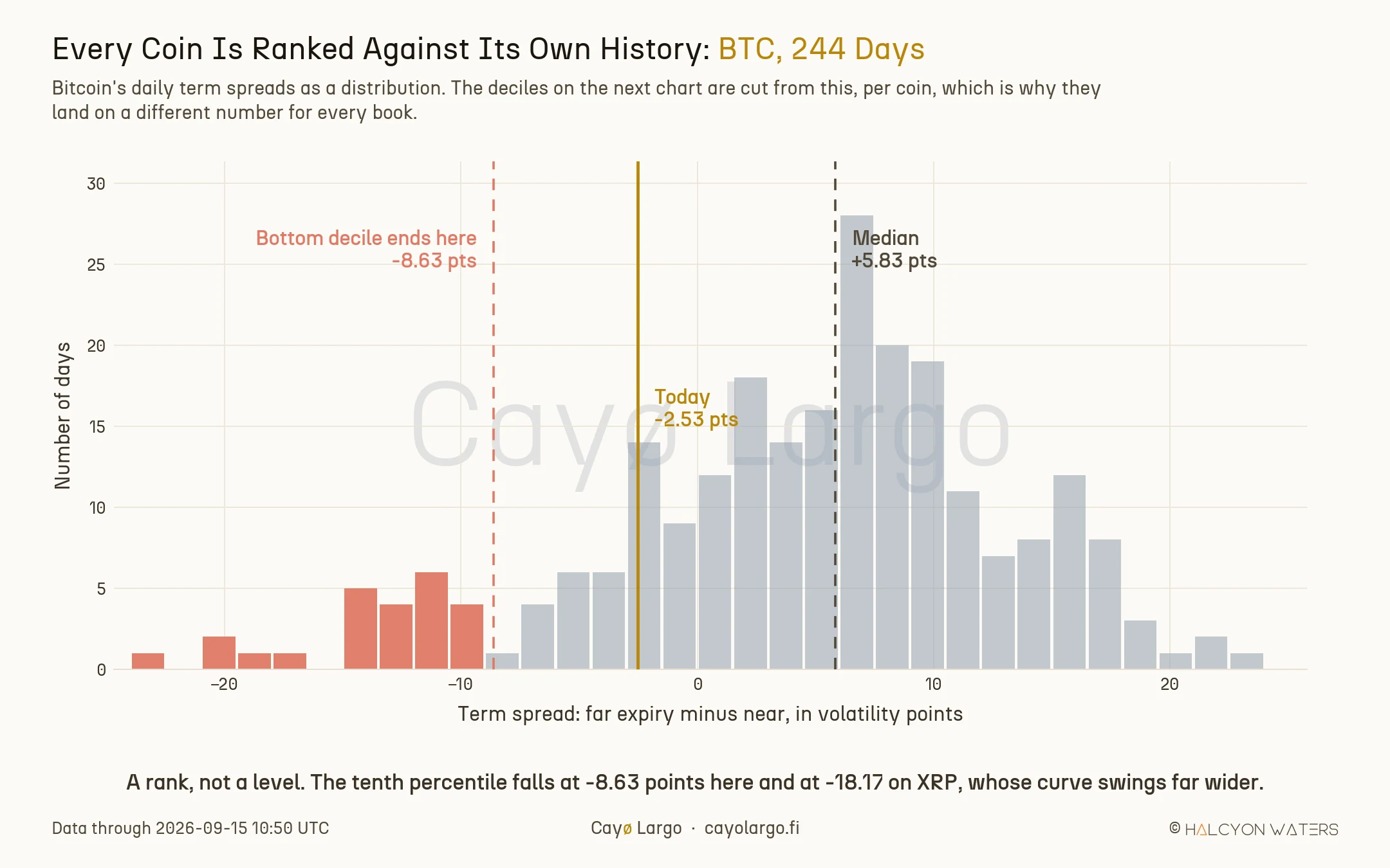
Figure 3: Bitcoin's 244 daily term spreads. The deciles used below are cut from this distribution, per coin, which is why they land on a different number for every book.
Bitcoin's tenth percentile falls at -8.63 points. XRP's falls at -18.17. Same rank, different number, and that is the point of ranking at all.
The answer is a curve, not a cliff
Here is every day in the archive, sorted into deciles by where its curve sat, against how often the front week turned out to be worth its price.
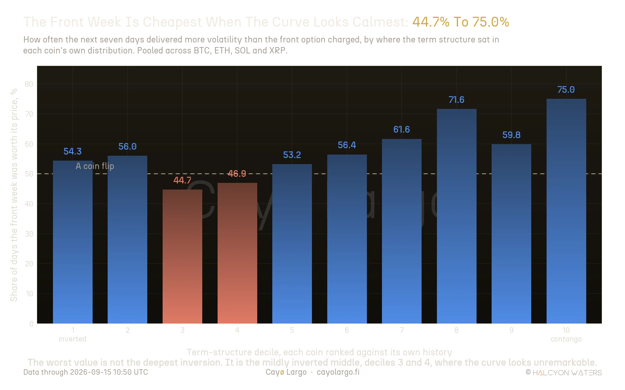
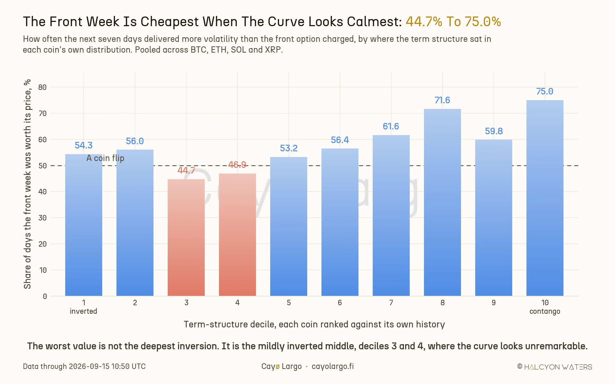
Figure 4: Share of days the next seven days delivered more volatility than the front option charged, by term-structure decile. The worst value is deciles 3 and 4, not the extreme.
| Term-structure decile | Days | Front week worth its price | Median realized / implied |
|---|---|---|---|
| 1, most inverted | 92 | 54.3% | 1.030 |
| 3 | 85 | 44.7% | 0.951 |
| 4 | 81 | 46.9% | 0.973 |
| 8 | 81 | 71.6% | 1.093 |
| 10, steepest contango | 84 | 75.0% | 1.495 |
Let's take two things out of that shape. The first is the headline: the calm end of the curve is where the front week has been cheap, three days in four, with a median week delivering roughly one and a half times what the option charged.
The second is stranger and only a decile view finds it. The worst value is not the deepest inversion. Deciles 3 and 4, where the curve is mildly inverted and looks entirely unremarkable, are the only two below a coin flip. The screaming curve at decile 1 is middling at 54.3%.
It is the same lesson every sailor learns from the barometer. When it drops hard you reef the sails and everyone on deck agrees about the weather. The reading that catches crews out is the slow, unremarkable sag that nobody bothers to log. The options market behaves the same way. Whatever is being priced at the extreme, it is roughly getting right; what it misprices is the quiet lean.
Two ways this could have been an artifact
A gradient like that invites two objections, and both are worth more than the finding if they hold.
The first is the price level. Inverted days carry high front implied volatility, and the variance risk premium is known to widen when implied is high. The curve might be a passenger. So the same measurement runs inside bands of implied level, comparing like with like.
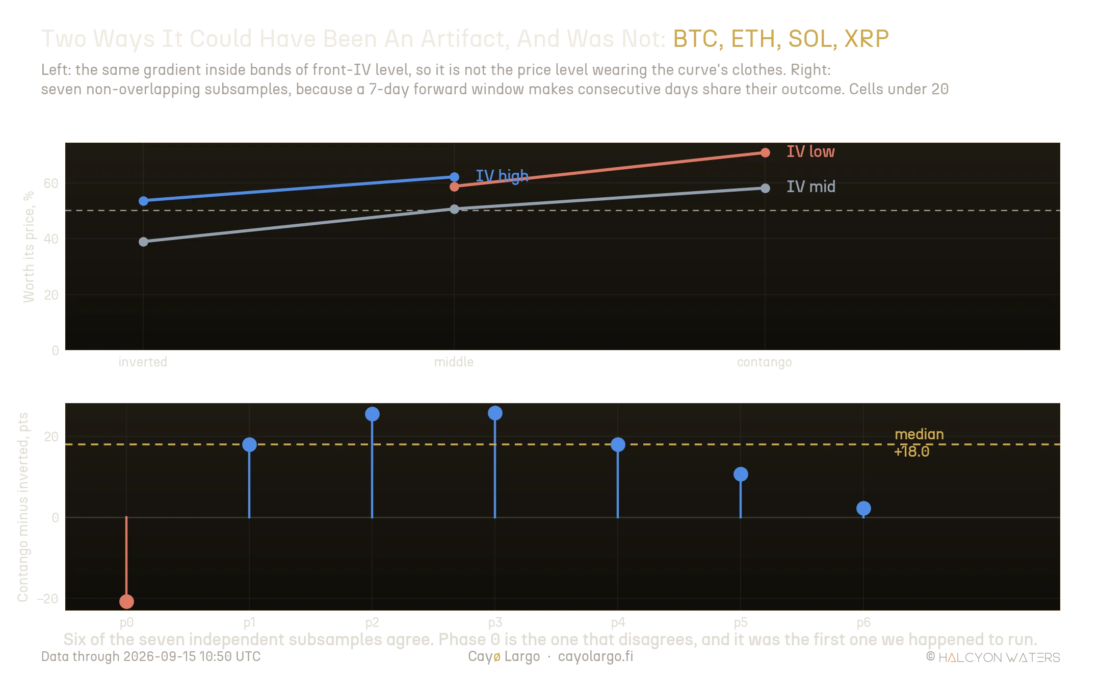
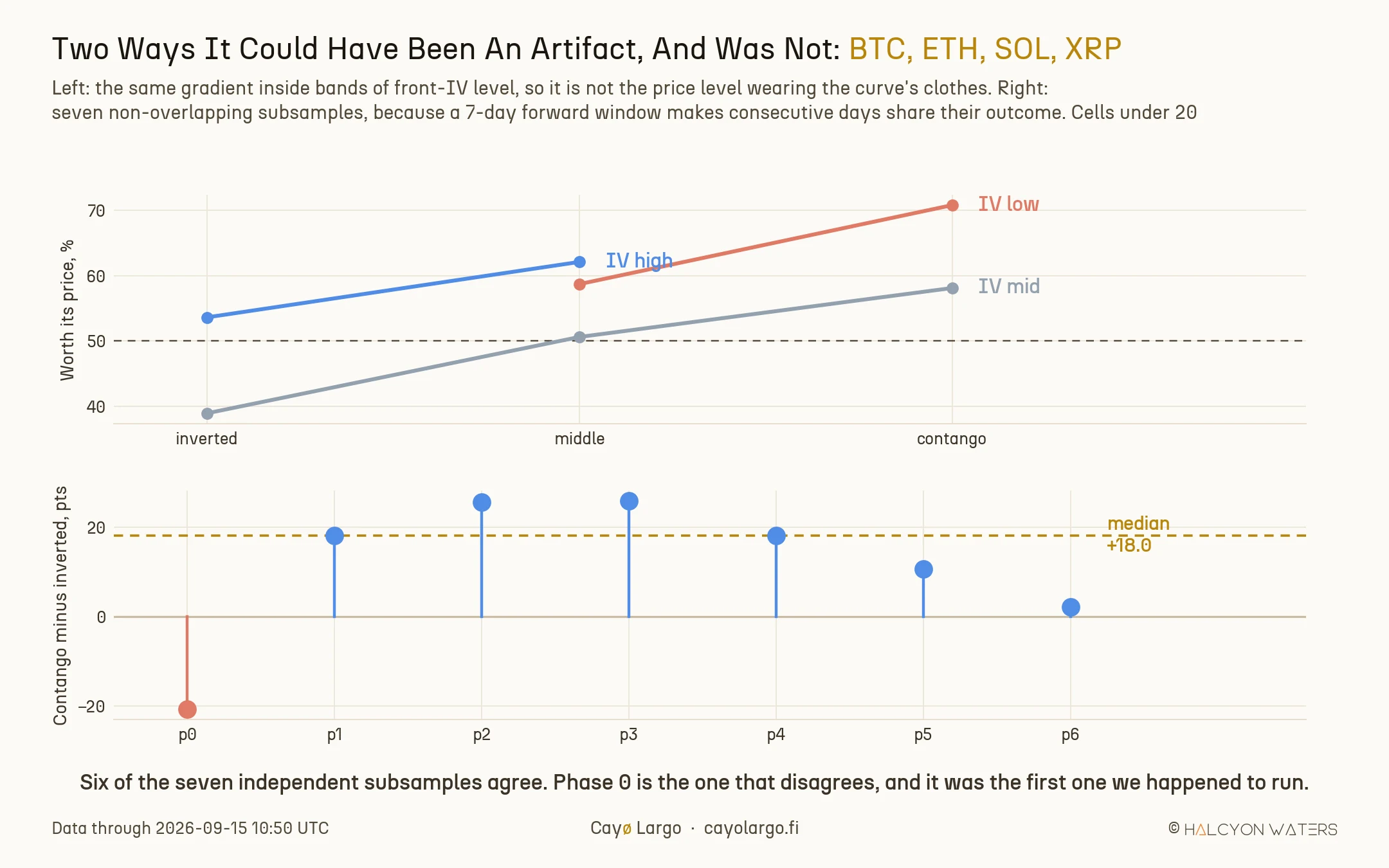
Figure 5: Left: the gradient holds inside each band of implied level, so it is not the price level in disguise. Right: the same measure on seven independent subsamples.
It survives. Among mid-implied days the front week was worth its price 38.9% of the time when inverted against 58.1% in contango, a 19.2 point gap at comparable price levels. The shape carries information the level does not.
The second objection is overlap, and it is the more dangerous one. A seven-day forward window on daily samples means two consecutive rows share six days of outcome. Eight hundred and thirty observations are nothing like 830 independent draws, and a handful of long episodes can carry an entire result.
The fix is to take every seventh day, which gives seven disjoint subsamples. The gap is positive in six of the seven, median 18.0 points. One is negative, at -20.7.
We would rather say which one that was. Phase 0 was the first subsample we ran, and for an hour it looked as though the whole relationship reversed. Running the remaining six is what turned one unlucky slice into a footnote rather than a headline.
Three books agree and Solana does not
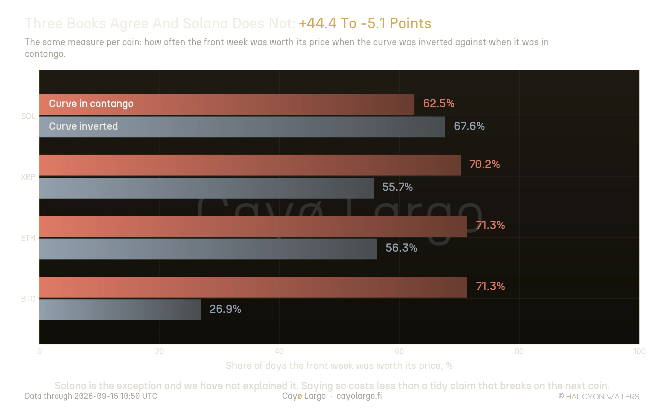
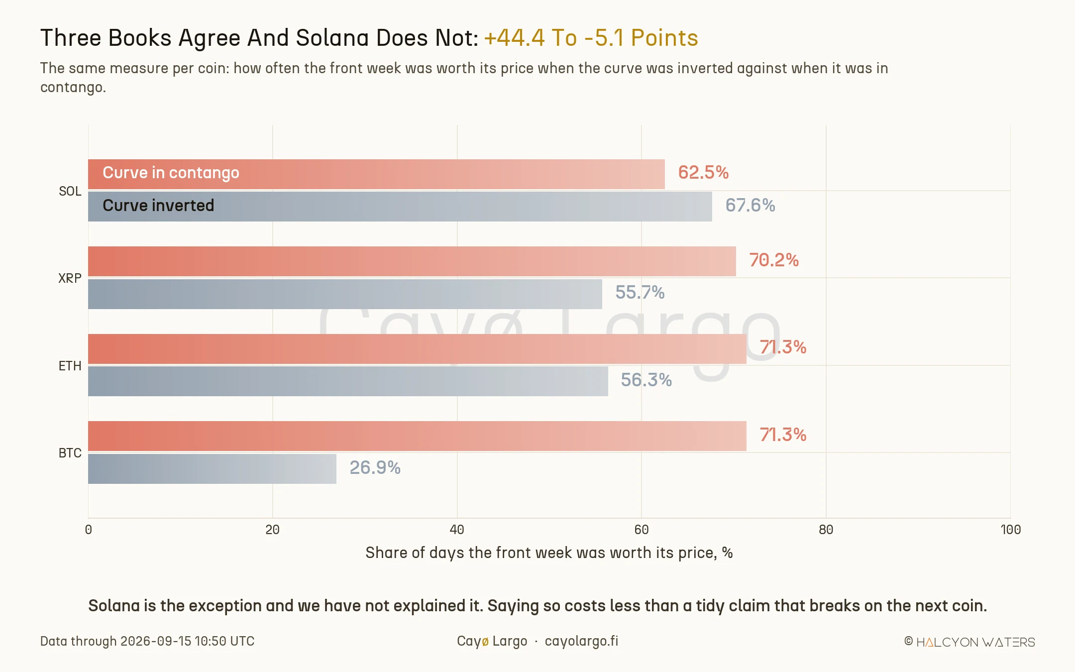
Figure 6: The same measure per coin. Bitcoin carries the effect most strongly; Solana runs the other way.
| Coin | Curve inverted | Curve in contango | Difference |
|---|---|---|---|
| BTC | 26.9% | 71.3% | +44.4 pts |
| ETH | 56.3% | 71.3% | +15.0 pts |
| XRP | 55.7% | 70.2% | +14.5 pts |
| SOL | 67.6% | 62.5% | -5.1 pts |
The effect lands hardest on Bitcoin, 26.9% against 71.3%, the widest gap in the set and on the deepest book in crypto. ETH and XRP agree at a third of that size. Solana runs the other way and we have not explained it. Keep in mind what an honest 830-day sample looks like. One book disagreeing is what you should expect. Four out of four would be the result to distrust.
How this was measured
Read from deribit_options_oria_coin_surface, the table behind the volatility term structure endpoint, from 15 January to 15 September 2026. Cayø Largo samples Deribit every 10 minutes; this study takes one cycle per coin per day, pinned to 10:50 UTC, because an unpinned daily sample confuses the intraday volatility rhythm for a daily one. The fields are term_structure_spread, atm_iv_dte_7 and realized_vol_7d.
A spread needs both of its ends, and this one is worth a guard. term_structure_spread is computed against atm_iv_dte_long. On days when the long tenor is absent the spread is taken against zero, and what lands in the column is minus the front implied: a 40 to 120 point inversion that never traded. Ranked without filtering, those rows crowd the bottom of the distribution on the thinner books.
Two lines of SQL fix it. Every query behind this note carries atm_iv_dte_long IS NOT NULL, and anyone ranking this field should carry it too. The same applies to a front implied outside a sane band, which is the expiry-day artifact that puts a 334% seven-day quote in the series.
Each day is ranked within its own coin:
where is the set of sampled days for coin . The outcome is the ratio of realized to implied rather than their difference, so the four coins pool without one book's scale swamping another. Every figure here is a rank or a share, never a mean: one expiry-day artifact moves an average and barely moves a rank.
What this does not say
The archive is 244 days and one regime. These are rates measured inside 2026, not a claim about how crypto volatility behaves across cycles.
It is a base rate, not a signal. Nothing here says the curve causes the next week's volatility. Deciles 8 and 10 read 71.6% and 75.0% while decile 9 sits at 59.8%, which is what sampling noise looks like on roughly 80 days per bucket. Read the slope of the whole thing, not any single bar.
The independence check is a check, not a proof. Six of seven subsamples agreeing is encouraging and is not a p-value, and the seven are drawn from the same eight months.
AVAX and TRX are excluded. After the guard above, AVAX has 84 usable days and TRX 88, too few to rank into deciles.
One thread is still hanging. Inversions that arrive with no realized move behind them appear to unwind faster than those following a genuine volatility spike, which would explain why a quiet lean prices worst. That deserves measuring properly rather than a paragraph here.
What a desk would watch
The useful question when the curve inverts is not how loudly it is warning. It is what the warning has cost. Over eight months of Cayø Largo's archive the answer is stubborn: the front week was dearest, relative to what followed, exactly where the curve looked mildly wrong, and cheapest where it looked most ordinary. Check where the curve sits in its own history before you price the week ahead, and treat a calm-looking contango as the interesting state rather than the dull one. For how long inversions persist once they form, see how long crypto backwardation lasts; for the implied-against-realized frame this note assumes, see the variance risk premium guide.
References
- 2023-01-24, Amberdata, Bitcoin Options: Finding edge in four years of volatility regimes. In the ATM term structure section, measures contango at almost 77.5% of the time across four years and describes backwardation as a reaction to volatility shocks.
- 2024-01-10, Imran Lakha, Beware The BTC Vol Reset. Records Bitcoin's term structure in backwardation ahead of the spot ETF deadline, with weekly options resisting decay until after the event: an inversion formed in anticipation rather than in reaction.
- 2025-03-20, Brett Friedman, OptionMetrics, VIX Futures Term Structure: A Warning Sign?. Finds the VIX futures curve backwardated on 18.8% of daily observations since February 2006, concentrated in the financial crisis and the pandemic.
Frequently Asked Questions
When is the crypto front week cheapest?
When the curve looks calmest. Pooled across BTC, ETH, SOL and XRP over 830 coin-days, the next seven days delivered more volatility than the front option charged on 75.0% of days in the steepest contango decile, against 44.7% in the mildly inverted deciles. The gradient runs the opposite way to what the shape suggests.
Is the front week overpriced when the crypto term structure inverts?
More often than in contango, but the deepest inversions are not the worst value. The bottom decile sits at 54.3% while deciles three and four, where the curve is mildly inverted and looks unremarkable, sit at 44.7% and 46.9%. The relationship is a curve rather than a cliff.
Is this just the implied volatility level rather than the curve shape?
No. Inverted days do carry higher front implied volatility, and the variance premium is known to widen when implied is high, so we measured the same gradient inside bands of implied level. It survives: among mid-implied days the front week was worth its price 38.9% of the time when inverted against 58.1% in contango, a 19.2 point gap at comparable price levels.
How were overlapping samples handled?
A seven-day forward window on daily samples means consecutive observations share six days of outcome, so 830 rows are not 830 independent draws. We re-ran the measurement on all seven non-overlapping subsamples. The contango-minus-inverted gap is positive in six of the seven, with a median of 18.0 points, and negative in one.
Related Articles
How Long Does Crypto Backwardation Last?
Across 4,712 inversion episodes on six coins, 67.1% of crypto term-structure backwardations were finished inside one hour and 0.81% lasted a full day.
Crypto Variance Risk Premium: Live IV vs RV on Six Coins
How to read IV vs RV charts and the variance risk premium to figure out whether crypto options are overpriced, underpriced, or fairly valued. Live AVAX example from Deribit.